
Best Kitchen Cabinet Paint Colors: LRV, Undertones, Test
The best kitchen cabinet paint colors start with what cannot easily change: the countertop, backsplash, flooring, wall color, and natural light. Use those fixed elements to narrow the undertone and depth, then use your design style, desired contrast, and a full-day sample test to choose the final shade.
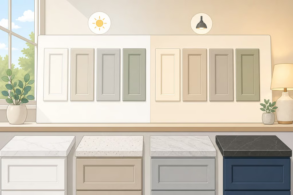
Before buying paint, gather photos of the kitchen in daylight and at night, note the direction of the windows, and identify the finishes staying in place. A cabinet color that looks beautiful in a showroom can turn too blue beside a cool countertop, too yellow against warm flooring, or too dark once evening lighting takes over.
Pantone’s 2026 Color of the Year, Cloud Dancer, is a balanced white and the first white selected during the Pantone Color Institute’s quarter-century of Color of the Year selections, Kitchen & Bath Business reported earlier this year. That is a useful reminder that “white” is not one decision. Warmth, depth, contrast, and light still shape how a neutral reads.
1. Start with the kitchen’s fixed finishes
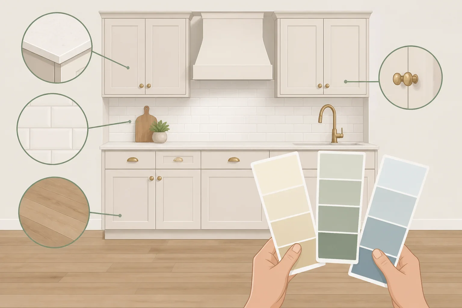
Before browsing painted kitchen cabinet colors by style, look at the materials already doing the visual work in the room. The countertop and backsplash are especially important because cabinets sit directly beside or beneath them. Pull out the quietest color in those surfaces rather than matching the most obvious one.
For example, a countertop with creamy, beige, or taupe movement may sit more comfortably beside a warm off-white, greige, or muted green than a stark blue-based white. A surface with cool gray or blue notes may make a warm cabinet color look yellow by comparison. This does not mean every finish must share the same undertone. It means the differences should look deliberate.
The wall color matters just as much. If the walls will remain white or cream, decide whether the cabinets should blend into them or stand apart. Sherwin-Williams shows white or cream on both walls and cabinets as one way to draw attention to a marble countertop and backsplash, while a richer cabinet color against neutral walls creates more focus on the cabinetry (Sherwin-Williams).
Use this quick comparison before choosing a color family:
- Busy countertop or backsplash: Keep cabinet color quieter so the room has a visual resting place.
- Plain countertop and backsplash: A deeper green, blue-gray, or warm taupe can provide needed character.
- Warm wood flooring: Compare samples carefully with the floor. A cabinet color that looks neutral alone may appear cooler or bluer beside the wood.
- Existing colorful walls: Test the cabinet sample against that wall color, not against a white screen or online image.
- Prominent metal hardware: Hold the sample near the pulls or knobs. The goal is not to match the metal exactly, but to see whether the color combination feels intentional.
Treat style as a starting point, not a final answer. A modern kitchen can use a soft sage. A traditional kitchen can use white. The surrounding finishes decide whether that color feels settled or out of place.
2. Use design style to narrow the color family
Once the fixed finishes are clear, choose two or three color families that could support the room’s overall mood. Manufacturer inspiration galleries are helpful here because they show relationships between cabinets, walls, islands, ceilings, and trim. They demonstrate possible combinations, not rules about which colors belong to a particular style.
Kitchen cabinet color ideas by design style
For a clean contemporary direction, Sherwin-Williams features Anew Gray on walls, trim, and upper cabinets with Elephant Ear on the island and the backs of cabinets. The same source lists Pure White, Futon, and White Duck among its recommendations for contemporary homes (Sherwin-Williams). The useful lesson is contrast within a restrained palette. If the kitchen already has a bold stone or patterned backsplash, a quieter upper-cabinet color and deeper island may be enough.
For a modern farmhouse palette, Sherwin-Williams documents Granite Peak cabinets with Pure White shiplap and Pediment walls. A separate example uses Touch of Sand on the cabinets and wainscoting with Snowbound on the shiplap and ceiling (Sherwin-Williams). These examples show two different directions: one with a deeper cabinet statement and one with a lighter, more blended envelope.
For a more colorful traditional or eclectic room, Farrow & Ball shows Parma Gray units with a Singed Red kitchen island and Dutch Pink walls. Another documented combination uses Sap Green in full gloss on a drinks cabinet with Duster walls (Farrow & Ball). These are specific room palettes, not categorical definitions of English country style. Still, they make a good case for testing a cabinet color alongside the wall and island instead of judging it by a paint chip alone.
A softer transitional kitchen may call for a muted sage or a nuanced off-white. Sherwin-Williams features Succulent cabinetry with White Sail walls, and another example pairs Sea Salt on an island with Stardew walls and High Reflective White on the ceiling and trim (Sherwin-Williams). If the room needs color but not a dramatic focal point, a muted shade can add interest without competing with the countertop.
At this point, do not ask, “What color is correct for this style?” Ask, “Which two or three colors could live comfortably with everything already in this kitchen?”
3. Choose contrast with LRV
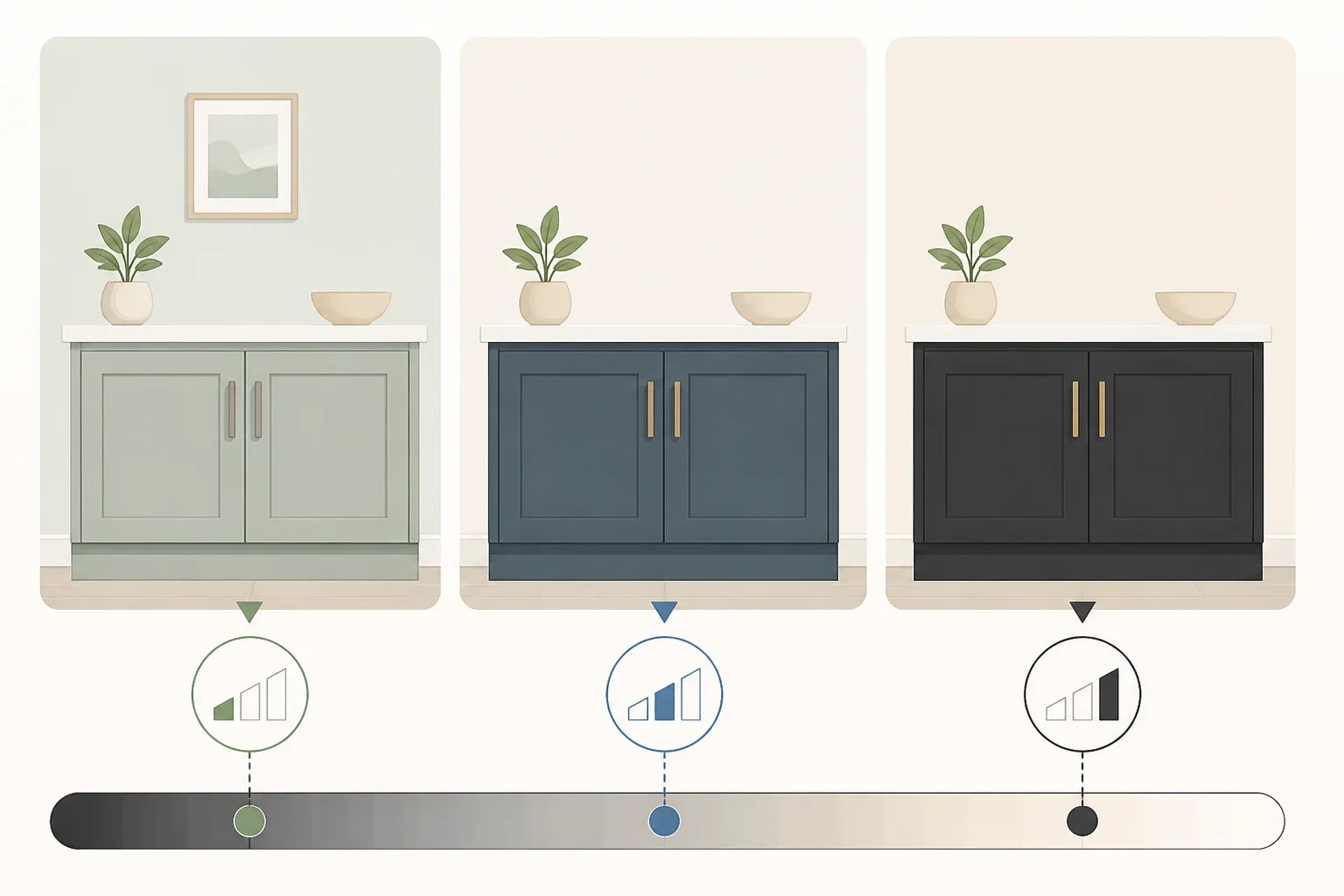
Light Reflectance Value, or LRV, measures how much light a color reflects on a scale from 0 to 100. Keadecor notes that major paint manufacturers, including Sherwin-Williams, Benjamin Moore, and Farrow & Ball, use the scale to quantify that relationship (Keadecor).
LRV is not a prediction of whether a color will be beautiful in your kitchen. It is a way to compare depth. Kylie M Interiors groups cabinet colors into rough bands:
- White: LRV 82–94
- Off-white: LRV 73–81
- Light: LRV 55–72
- Light-medium to medium: LRV 20–55
- Dark: LRV 2–19
Those ranges are design guidelines, not universal standards. A dark cabinet in a bright kitchen may feel balanced, while the same color in a dim room may feel heavy.
For wall-to-cabinet contrast, Kylie M Interiors suggests roughly 15 to 20 LRV points for a low-contrast look, 30 to 40 points for medium contrast, and 45 or more for high contrast (Kylie M Interiors). Use the numbers to describe the effect you want:
- Low contrast: Cabinets and walls feel connected, calm, and close in depth.
- Medium contrast: The cabinetry is clearly defined without becoming the only feature.
- High contrast: The cabinets become a strong architectural element.
The source gives a practical example with Sherwin-Williams Pewter Green at LRV 12 and Egret White at LRV 70, a 58-point difference. That creates a high-contrast pairing, though whether it suits a particular farmhouse, traditional, or contemporary kitchen depends on the rest of the room.
If two colors differ by fewer than 15 LRV points, Kylie M Interiors suggests considering the same color on the cabinets and walls, with the exception of white cabinets. That can be more cohesive than choosing two nearly identical colors whose undertones do not quite agree.
To compare your own finalists, write down the LRV for each cabinet color and the wall color. A pale sage and a deeper green may belong to the same color family, but their LRV difference will tell you whether the room feels tonal or dramatic. Then check the result against the countertop and floor. A numerical gap cannot account for every reflection and undertone in a busy kitchen.
4. Check undertones and lighting
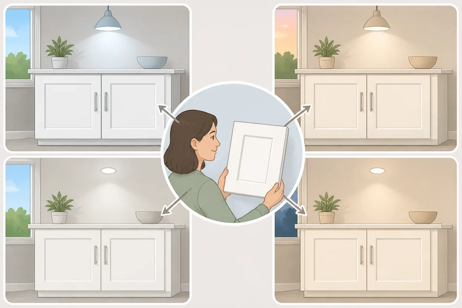
Every paint has a mass tone, the color seen first, and an undertone, the less obvious yellow, pink, green, blue, or violet cast that emerges under particular lighting. Keadecor explains that two paints can have the same LRV and still look noticeably different because LRV measures the amount of reflected light, not its color temperature (Keadecor).
This is why a white cabinet sample can look clean in the store and yellow at home. Sherwin-Williams describes White Duck and Creamy as warm whites with yellow undertones, while Toque White and Eider White are described as cool whites with blue undertones (Sherwin-Williams).
Your kitchen’s light will influence that shift. According to Keadecor, north-facing windows and bulbs rated 4000K or higher tend to bring out cool blue or violet undertones. South-facing windows and 2700K bulbs tend to intensify yellow and red warmth. These are tendencies, not guarantees. Window size, nearby buildings, weather, flooring, and surrounding finishes all affect what reaches the cabinets.
Use the sample to diagnose the problem:
- Too blue: Compare it with a warmer finalist, or place it beside the countertop to see whether the stone is amplifying the coolness.
- Too yellow: Test a more balanced or cooler neutral, but check that it does not turn gray or violet in evening light.
- Too dark: Compare the sample against the floor and backsplash, not only the wall. A dark color may still work on an island if the rest of the room is light, but it deserves a larger test.
- Too close to the wall: Check the LRV difference and undertones. If the colors are nearly the same depth but have different bases, the result may look accidental rather than tonal.
5. Test the color and prepare before painting
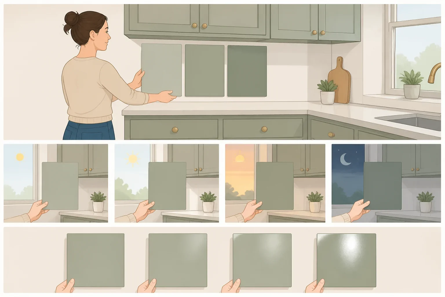
Do not paint a final cabinet door based on a digital image or a small paper chip. Make a movable sample first. Keadecor recommends painting the color on poster board with a white border and holding it against the cabinets. Testing directly over a colored wall can distort the result because the background influences how the sample appears (Keadecor).
Test two or three finalists in the actual kitchen. Move the boards beside the countertop, backsplash, flooring, hardware, and wall. Look at them from across the room as well as up close. A color that seems attractive on a small board may feel too strong when repeated across a full run of cabinets.
Check the samples at several points in the day. Keadecor suggests approximately 8 a.m. for cool morning casts, noon for glare or washout, 5 p.m. for intensified warmth, and 9 p.m. under artificial light. These checkpoints are practical examples, not fixed lighting conditions for every home. The important part is seeing the color in the light the kitchen actually receives.
Test the finish you plan to use. Keadecor notes that official manufacturer LRV numbers are generally measured using flat or matte formulations, while higher sheen reflects light more directly and may make the perceived LRV roughly 1 to 2 points higher. Do not assume a matte sample will look identical in the finished sheen.
Finally, follow the paint manufacturer’s preparation system for the specific cabinets. Sherwin-Williams representatives typically recommend Extreme Bond Primer and Emerald Urethane Trim Enamel for cabinet refinishing, but that recommendation should not be treated as a universal prescription for every surface or paint system (Sherwin-Williams). Clean, sand, prime, and allow the coating to cure according to the product directions. Inadequate cleaning, preparation, priming, or curing can contribute to adhesion problems, so the color decision is only half the project.
The best kitchen cabinet paint colors are the ones that pass four checks: they suit the room’s fixed finishes, create the intended amount of contrast, hold their undertone in both daylight and evening light, and work with the preparation and finish required for the cabinets. Compare the finalists in place before buying enough paint for the whole kitchen, then choose the shade that still looks right when the room is being used, not just when the sample is standing alone.
