
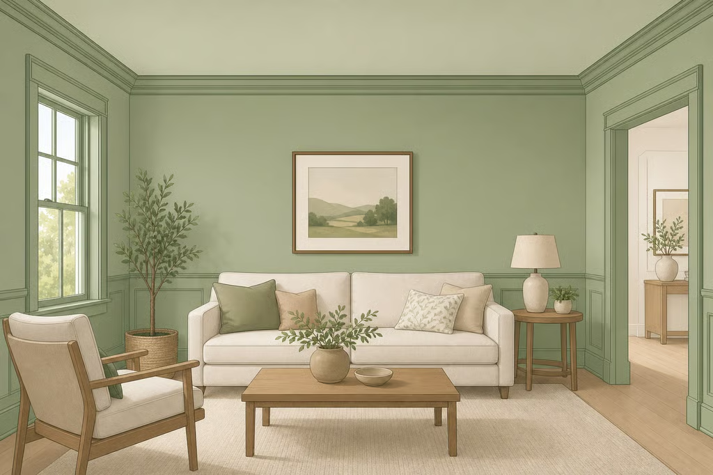
Color Drenching Molding Ideas: Paint Trim Same Color
Painting the trim to match the walls can either highlight beautiful architectural detail or help awkward millwork recede. These color drenching molding ideas can help decide whether to paint trim and walls the same color, include the doors and ceiling, or leave the molding white.
Color drenching is the name for carrying one hue across the walls, trim, doors, casings, molding, and sometimes the ceiling. The result can feel quiet and cohesive in a pale cream, or much more dramatic in navy, forest green, or burgundy. The key is to look at the room before choosing paint. As designer Maria Killam explains in a color drenching guide, this is a larger commitment than repainting the walls alone because reversing the decision can be expensive.
What color drenching does to walls and molding
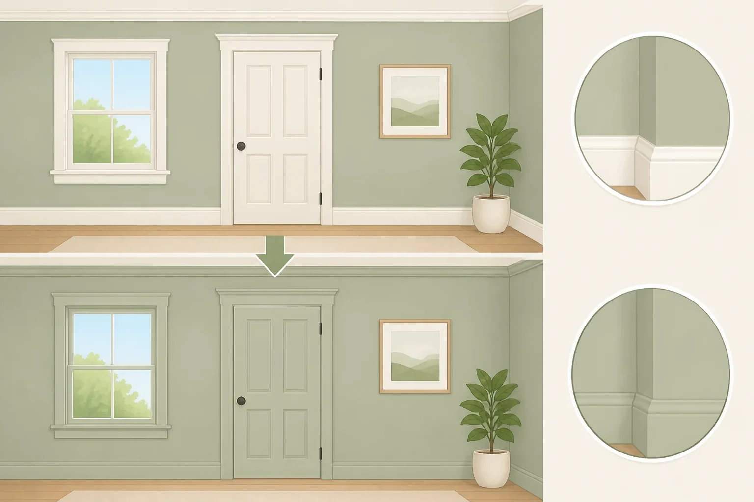
Traditional rooms often use a colored wall with white trim, creating a clear line around doors, windows, baseboards, and architectural molding. Color drenching removes that contrast and lets one hue move across the room instead.
The technique works in both contemporary and period homes. JLE Studio describes it as a continuous color treatment that can look subdued or striking, depending on the shade and the amount of the room that receives it. Pale off-whites, ivory, and muted creams can enhance the feeling of light and space, while darker colors such as navy, forest green, and burgundy create a jewel-like effect, according to JLE Studio.
“The same color” does not have to mean the same paint product or the same sheen everywhere. A wall may need a lower-sheen finish, while trim, doors, and baseboards may benefit from a more washable satin or semi-gloss finish. The hue stays coordinated, but the finish can respond to how each surface is used.
Interior doors are part of the decision, too. Benjamin Moore color expert Arianna Barone recommends carrying the wall-and-trim color onto interior doors when a fully continuous look is the goal, particularly with bolder colors. That choice makes the doors part of the room’s architecture instead of leaving them as separate white rectangles.
Before choosing paint, decide which features should stand out and which should recede. That choice determines whether a full drench is useful or simply adds work.
Color drenching molding ideas: showcase or camouflage?
Walk around the room in daylight and examine the molding from several angles. Pay attention to its depth, condition, proportions, and relationship to the doors and windows. A continuous color treatment will not fix every problem, so separate design issues from repair issues before buying paint.
Showcase detailed molding
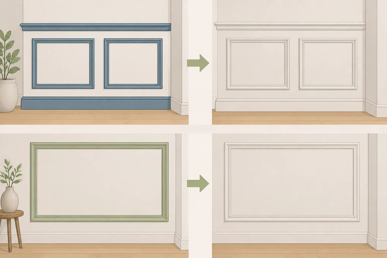
Color drenching is especially suited to rooms with real architectural detail, including:
- Paneled molding
- Picture-frame molding
- Wainscoting
- Deep window or door casing
- Detailed cornices
- Elaborate baseboards
- Existing wall paneling
These features can still be seen when painted one color because their shadows and changes in depth remain visible. JLE Studio notes that a single color can give period details more impact while keeping the architectural forms readable.
A darker or more saturated shade can make the molding feel intentional and substantial. A pale shade creates a quieter version of the same effect. The color does not need to be bold for the method to work.
Camouflage awkward or mismatched trim
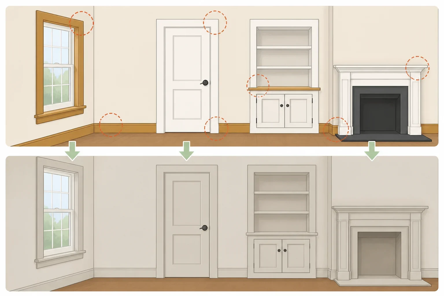
Matching the trim to the wall can also reduce the contrast around narrow molding, mismatched millwork, or exposed features such as pipes. Redesign’s guidance describes this as a way to make those elements less noticeable and to simplify rooms that otherwise feel visually choppy.
That does not mean paint should cover a problem that needs repair. Do not use a same-color treatment to hide structural damage, unsafe wiring, leaking pipes, or anything that needs regular access. Fix or address the underlying issue first. If a pipe, shutoff, panel, or other service point must remain accessible, plan around it rather than sealing it behind decorative work.
Open-concept layouts require extra planning. There may not be a clear room boundary to tell the eye where the color should stop, and a color change can look abrupt when it lands in the middle of a shared space. Redesign notes that color drenching becomes more complicated in open-concept homes. In that situation, map the color boundary before painting and consider whether the same treatment makes sense for every connected area.
How to paint trim and walls the same color
Gather the supplies before starting:
- The chosen interior wall and trim paint
- A compatible primer
- Painter’s tape
- Drop cloths or floor protection
- Cleaning cloths or a damp sponge
- Caulk for appropriate small gaps
- Filler for nail holes
- Sandpaper suitable for the surface
- Brushes and rollers suited to the paint
- Screwdriver or other tools for removing hardware
Benjamin Moore’s interior trim painting guidance also recommends painter’s tape, primer, and interior paint as basic supplies. Check the paint label for surface preparation, ventilation, drying, and recoat directions before beginning.
1. Inspect the room and fixed finishes
Look at the proposed color beside the flooring, countertops, tile, cabinetry, and any other finishes that will remain. Undertones that seem subtle on a screen can become much more noticeable when the same color covers the walls, trim, doors, and ceiling. Redesign specifically warns that an undertone mismatch is amplified when there is no contrasting trim to balance it.
Also inspect the molding itself. Look for peeling areas, glossy patches, dents, nail holes, open joints, and old caulk that has separated. Note whether doors, hinges, latch plates, outlet covers, and other hardware should be removed before painting.
Do not start by assuming every surface can receive the same coating. Previously painted, glossy, damaged, or unknown older surfaces may need different preparation. If the surface condition is unclear, stop before sanding or disturbing it and follow the paint manufacturer’s guidance.
2. Test the color in the actual room
Apply a real sample to a removable board or an inconspicuous area of the room. Test it near the trim, beside the flooring, and close to the doors. View it in daylight and at night with the room’s regular lighting.
Benjamin Moore recommends using color samples before purchasing paint because lighting and undertones affect how a color reads. A shade that looks soft on a phone may feel much stronger across a large wall. A sample also lets you compare the color with the finish you intend to use rather than relying on an online image.
Leave the sample in place long enough to see whether the room still feels comfortable at different times of day. If the color looks wrong next to a fixed finish, changing the shade now is much easier than repainting the whole room later.
3. Clean and repair the surfaces
Protect the floor and nearby furniture before preparing the room. Remove dust and grime from the trim, then wipe it with a damp sponge or cloth and let it dry thoroughly. Benjamin Moore includes cleaning and drying as part of trim preparation.
Fill small nail holes and repair minor surface damage with an appropriate filler. Caulk suitable gaps where the molding meets the wall, but do not caulk moving joints or areas that need to remain accessible. Allow repairs to dry fully, then sand rough spots and glossy areas according to the product directions.
Keep the preparation consistent across the room. A same-color scheme draws attention to uneven sheen, ridges, and missed repairs because there is no white trim to break up the view.
4. Prime where the surface calls for it
Prime repaired areas and any surface that requires better adhesion, stain coverage, or a uniform base. Allow the primer to dry for the time listed on its label before applying paint.
The primer and finish paint should be compatible with the existing surface. Test a small area if the old coating is glossy, damaged, or unfamiliar. Do not rush from wet primer to finish paint. The result may look uneven even when the color itself is right.
5. Remove or protect hardware
Remove door knobs, latch plates, outlet covers, and other hardware when practical. If something cannot be removed, cover it carefully with painter’s tape.
Painting around hardware can leave a rough edge and may interfere with moving parts. Keeping the hardware clean also makes the finished room look more deliberate, especially when doors are included in the color drenching.
6. Paint from the top down
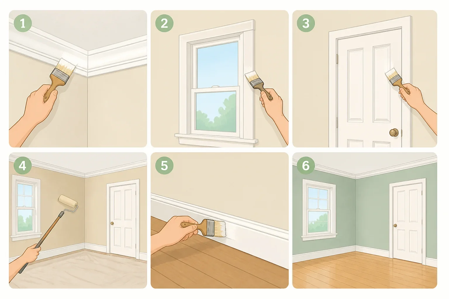
Work in this order:
- Molding or crown molding
- Window trim
- Door frames
- Walls
- Baseboards
Benjamin Moore recommends starting at the top and moving downward through the trim in this sequence. Working from high surfaces to low ones helps prevent fresh paint from being damaged by later work.
Use a steady brush on the molding and keep a wet edge where surfaces meet. Apply the number of coats listed by the manufacturer rather than adding another coat simply because the first one looks uneven while wet. Let each coat dry and follow the stated recoat time.
7. Choose the sheen separately from the hue
The trim, walls, doors, and ceiling can share a color without sharing a finish. Benjamin Moore lists satin, semi-gloss, and high-gloss finishes as common choices for interior trim, with higher sheens offering more stain resistance and standing up better to repeated washing in high-traffic areas.
That does not make the highest sheen the right choice for every room. A lower-sheen wall paired with a washable satin trim can create a quiet difference while keeping the color continuous. For a more blended look, use closer finishes. Test the combination before committing, because sheen changes how strongly the color reflects light.
Lower-commitment painted molding ideas
A full drench is not the only way to create a connected room. These variations let the ceiling or finish do some of the work without requiring every surface to receive the same treatment.
Color cap the ceiling
Color capping means treating the ceiling as a deliberate design surface instead of automatically painting it stark white. The ceiling might receive a lighter version of the wall color, a complementary tone, or the room’s only colored paint. The walls and trim can remain simpler while the ceiling adds a controlled connection.
Redesign describes color capping as a way to create cohesion without drenching the entire room. In rooms with lower ceilings, a softer ceiling treatment may also feel less harsh than a strong white contrast line.
Leave the ceiling lighter
Ceilings are often included in a full color-drenching scheme, but the right treatment depends on the room’s natural light. JLE Studio notes that darker or north-facing rooms may call for a white or lighter ceiling instead.
Leaving the ceiling white is not a failure to complete the look. It is a practical choice when a darker overhead color makes the room feel too heavy. A lighter ceiling can let the walls, trim, and doors carry the main color while preserving a visual break above.
Change the finish, not the color
Finish can add variation without introducing another hue. JLE Studio notes that a glossier ceiling finish may bounce light back into the room, while a flat finish can create a more blended full-drench effect.
Use the paint manufacturer’s directions for the surface and location. A finish that looks beautiful on a sample may not be the right choice for every ceiling, wall, or high-touch trim surface.
Make the decision before buying full gallons
Use this checklist before starting:
- Choose a full drench when the room has molding, paneling, wainscoting, or other detail worth emphasizing.
- Consider matching the trim and walls when narrow, mismatched, or visually busy millwork is competing for attention.
- Repair damage and address unsafe or accessible features before painting.
- Test the color beside flooring, tile, countertops, and other fixed finishes.
- Decide separately whether the doors and ceiling belong in the scheme.
- Match the hue, but choose sheens based on each surface’s use.
- Follow the paint manufacturer’s preparation, drying, and recoat instructions.
- Use color capping or a lighter ceiling when a full drench feels too heavy.
The best color drenching molding ideas respond to the room rather than copying a trend image. Start with one sample, view it in daylight and at night, and decide whether the molding deserves attention or should quietly recede. Only then is it time to buy the paint and begin.
