
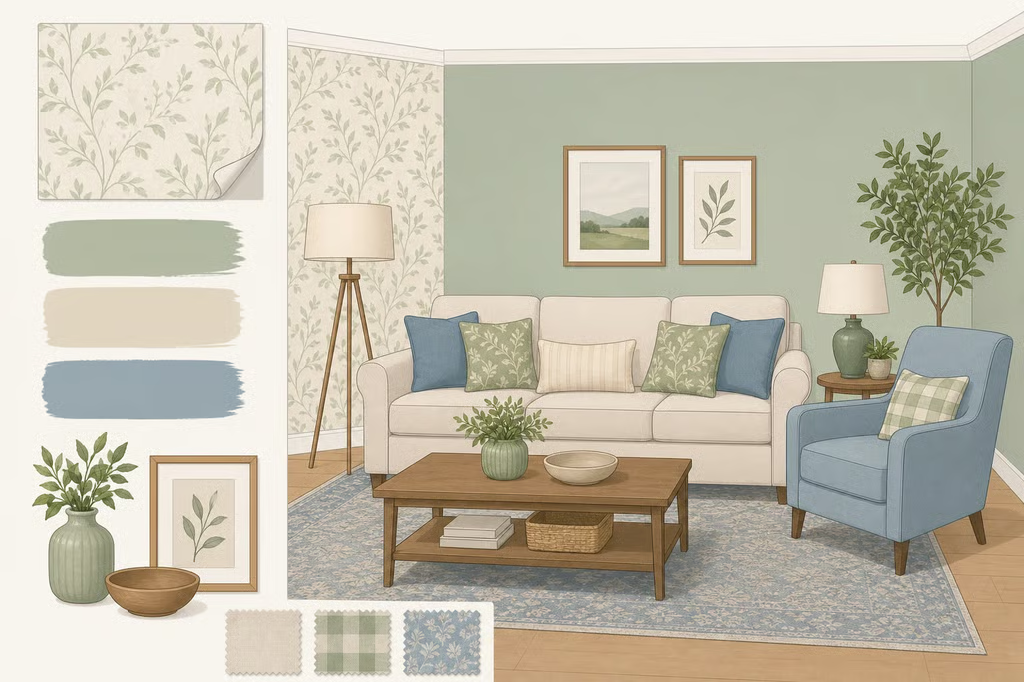
How to Match Wallpaper With Paint and Decor: 4 Rules
Learning how to match wallpaper with paint and decor starts with one simple decision: choose from the wallpaper, not from a paint card that merely looks similar. Pull out a real color, check its undertone against the room’s fixed finishes, decide which element should lead, and then add patterns at a different scale. By the end, the room should feel planned rather than like a collection of attractive pieces competing for attention.
Pattern is having a moment. Good Housekeeping reports that 61% of respondents would consider adding at least one type of pattern to their home over the next year. The available research does not detail the survey methodology, so treat that figure as a broad trend signal, not a reason to force wallpaper into every room.
The first mistake to avoid is choosing a paint color that is merely close. Apartment Therapy’s designers recommend finding a shade that actually appears in the wallpaper, then using it with intention. Follow these four steps before buying full rolls or gallons.
1. Pull a color directly from the wallpaper
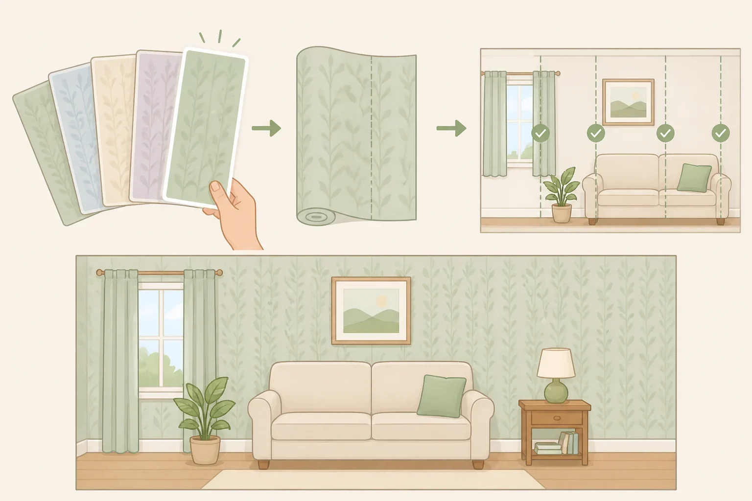
Study the wallpaper as a group of colors rather than one overall impression. Look at the background, the largest pattern color, and the quieter shades tucked into leaves, outlines, branches, or geometric details. A less obvious color may be more useful for paint, trim, or furniture than the boldest shade in the print.
Choose one color from the paper and repeat it in at least two other places in the room. Interior designer Wendi Gee recommends possibilities such as a cushion, rug, lamp base, or piece of art. One repeat can look accidental; two or three make the connection feel deliberate.
Use those repeats at different visual levels:
- Pick up the color in trim, an interior door, or another painted detail.
- Repeat it in a cushion, throw, rug, or upholstered piece.
- Bring it back in a small object, artwork detail, or lamp base.
The pieces do not need to match. A fabric can carry a little of the wallpaper’s rust color, while the trim uses a lighter version and the artwork repeats it in a small detail. The goal is a relationship between pieces, not a room full of matching sets.
Trim and millwork are especially useful when the wallpaper is muted or has a small, single-color print. Chauncey Boothby of Apartment Therapy recommends picking up a color from the wallpaper for trim and millwork, even when that color is only hinted at in the design. It can give the paper a clearer frame.
Do not settle for a near-match because it is easier to find. Boothby’s practical solution is to ask a paint vendor to color-match a specific shade from the wallpaper or create a lighter “cut” version of it. That preserves the connection without requiring the walls, trim, and wallpaper to have the same depth.
Before buying new accessories, check what is already in the room. A rug, upholstered chair, framed artwork, or lamp may already repeat the color you need. If two natural repetitions are already there, the room does not need three more.
2. Match wallpaper to paint colors and fixed finishes
Once a color has been pulled from the wallpaper, check its temperature and undertone. This is where a promising combination can either settle into place or feel slightly off.
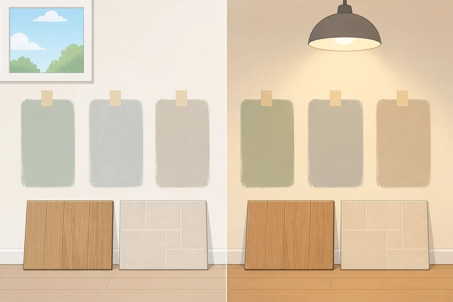
Start with the wallpaper in daylight, then look at it again under the room’s artificial lighting. You may notice that a neutral leans warmer or cooler than it first appeared, or that a seemingly quiet pattern has a stronger color cast beside a paint chip. Treat those observations as part of the testing process, not as fixed rules about what every color must do.
Wendi Gee’s guidance is to let the wallpaper’s dominant tone guide the temperature of the paint, furniture, and textiles rather than choosing each element in isolation. Her example is a warm, saturated wallpaper paired with cool-gray furniture. In her design judgment, the combination can feel slightly off, while warm upholstery and natural wood feel more comfortable beside it.
For common wallpaper and paint color combinations, Painters Incorporated offers a general pairing guideline: cooler grays can work with blue shades, while warmer cream or beige can complement browns and reds. Use that as a starting point, not a guarantee. The exact wallpaper, surrounding finishes, and lighting still need to be tested together.
Check the room’s permanent features before choosing paint. Hold samples near the flooring, tile, brick, marble, cabinetry, and existing trim. Benjamin Moore recommends using hard surfaces such as tile, brick, marble, and flooring to guide color selection, and comparing similar chips side by side to reveal subtle undertones in neutrals and grays.
That check may point toward a stronger contrast or a quieter companion color. Benjamin Moore’s example pairs rich blue walls with warm-toned terracotta tile. The useful lesson is simple: let the finishes already staying in the room join the color conversation before adding another large surface.
For a rental or a room with expensive existing finishes, this step matters even more. A removable wallpaper sample and paint swatches can be moved around the room without committing to a wall treatment. Keep the fixed finishes visible while making the decision.
3. Decide what leads the room
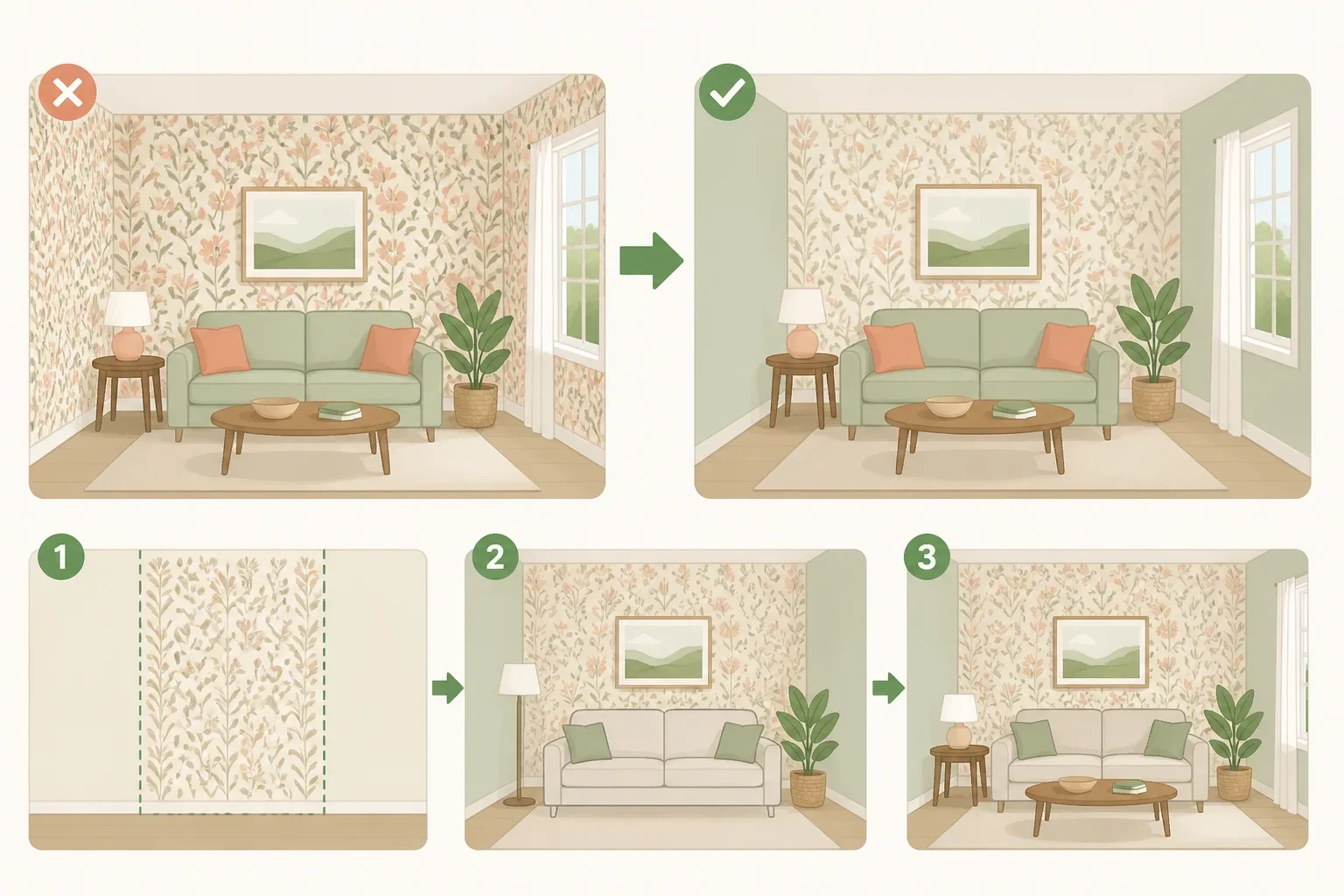
Choose whether the wallpaper or the paint should be the dominant element before selecting furniture and accessories. This one decision prevents a bold pattern, bright upholstery, colorful art, and competing accents from all demanding attention at once.
If the wallpaper is large-scale, busy, glossy, or strongly colored, let it lead. Use a quieter paint color from the paper or a neutral that supports it. Then bring in furniture and fabrics that give the eye somewhere to rest. Good Housekeeping cites designer Joe Waroquier’s suggestions of an antique wood piece, rich velvet, or a natural woven texture. Those materials can complement a strong pattern without copying it.
If the wallpaper is delicate or limited to an alcove, the painted walls can carry more of the room’s presence. Wallpaper can also highlight an alcove, the wall behind built-in shelving, a fireplace, or a staircase while paint frames the surrounding area. Molding or a chair rail can create a clean transition between the two surfaces.
Do not divide the room evenly just because it contains both paint and wallpaper. Painters Incorporated recommends varying the proportions instead. Place wallpaper above a chair rail with paint below it, paper one architectural section while painting the larger surrounding walls, or wrap wallpaper around a fireplace or staircase and use flat paint to frame it.
Color needs a similar hierarchy. Benjamin Moore advises using one shade as the dominant color and bringing in the other as an accent rather than giving two strong complementary colors equal weight. If one color is vivid, a muted version of its partner can provide balance.
Cara Fineman, writing for Apartment Therapy, makes the same point in plainer terms: when every element is colorful, the room can feel chaotic. After choosing the lead element, leave some surfaces quiet. A plain wood table, solid upholstery, or restrained artwork may do more for a patterned room than another colorful print.
4. Layer pattern at a different scale
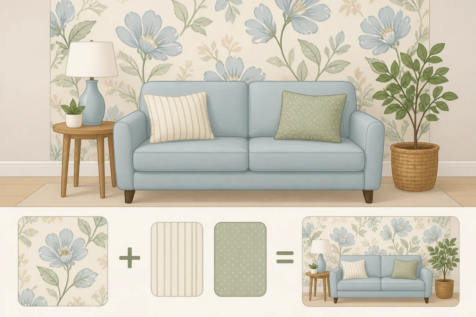
A wallpapered room does not have to be pattern-free beyond the walls. The safer way to mix prints is to make the scale clearly different.
Pair a large-print wallpaper with a small stripe, fine check, or subtly patterned upholstery. Avoid placing another large, high-contrast print directly beside it unless one pattern is noticeably quieter. Waroquier’s guidance, reported by Good Housekeeping, is to vary the scale, such as combining large wallpaper with a smaller stripe or understated upholstery.
Connect the patterns with one shared color. It might appear in the wallpaper’s background, a small motif, or an accent that is barely visible from across the room. A cushion stripe or rug border can repeat the shade without making it the main color of every object.
Consider a warm floral wallpaper with a cream ground, terracotta flowers, olive leaves, and a small amount of muted blue. Cream paint keeps the floral paper in charge. Natural wood supports the warmer side of the scheme. A small cream-and-terracotta stripe on one cushion echoes the wallpaper without reproducing it, while a muted blue lamp base or artwork detail brings in the less obvious accent.
Finish matters, too. Painters Incorporated recommends matte paint as a soft contrast against glossy or metallic wallpaper. For textured wallpaper such as grasscloth or an embossed design, the company recommends a smooth, flat paint finish so the painted walls do not compete for attention.
Treat those finish pairings as recommendations, not universal rules. Consider the room’s existing trim, lighting, and practical care needs. Before painting near specialty wallpaper, check the wallpaper manufacturer’s instructions for the product you are using. If the finish or installation is unfamiliar, test the combination on a sample rather than discovering a problem on the finished wall.
Test the combination before buying
Order a physical wallpaper sample and place it beside two or three shortlisted paint samples. Online images and small store chips can help narrow the choices, but they cannot show how the actual materials relate on the wall.
Tape the grouping where the wallpaper or paint will be used. Place it near the floor, tile, cabinetry, upholstery, and trim that will remain in the room. Benjamin Moore and Painters Incorporated both recommend checking the combination in natural and artificial light, including during the day and after the room’s lights come on.
Look at the samples from across the room, then close up. Ask three practical questions:
- Does the paint support the wallpaper or compete with it?
- Do the undertones look comfortable beside the fixed finishes?
- Is the wallpaper clearly leading, or are several elements fighting for attention?
If the pairing feels wrong, change one variable at a time. Try a warmer or cooler paint, reduce the saturation, choose a quieter finish, or move the wallpaper sample to another wall. A small adjustment is easier to judge when the other materials remain the same.
Make the decision in order
The final choice does not require an exact match. Choose a color that genuinely appears in the wallpaper, repeat it in at least two places, check its undertone against the room’s permanent finishes, and decide whether the paper or paint should lead. Then add patterns at a different scale and use finish to keep the surfaces from competing.
Before buying full quantities, live with the wallpaper sample and paint swatches in daylight and artificial light. That test can catch a mismatch before you buy the gallons and rolls, leaving the finished room connected without making every piece look identical.
