
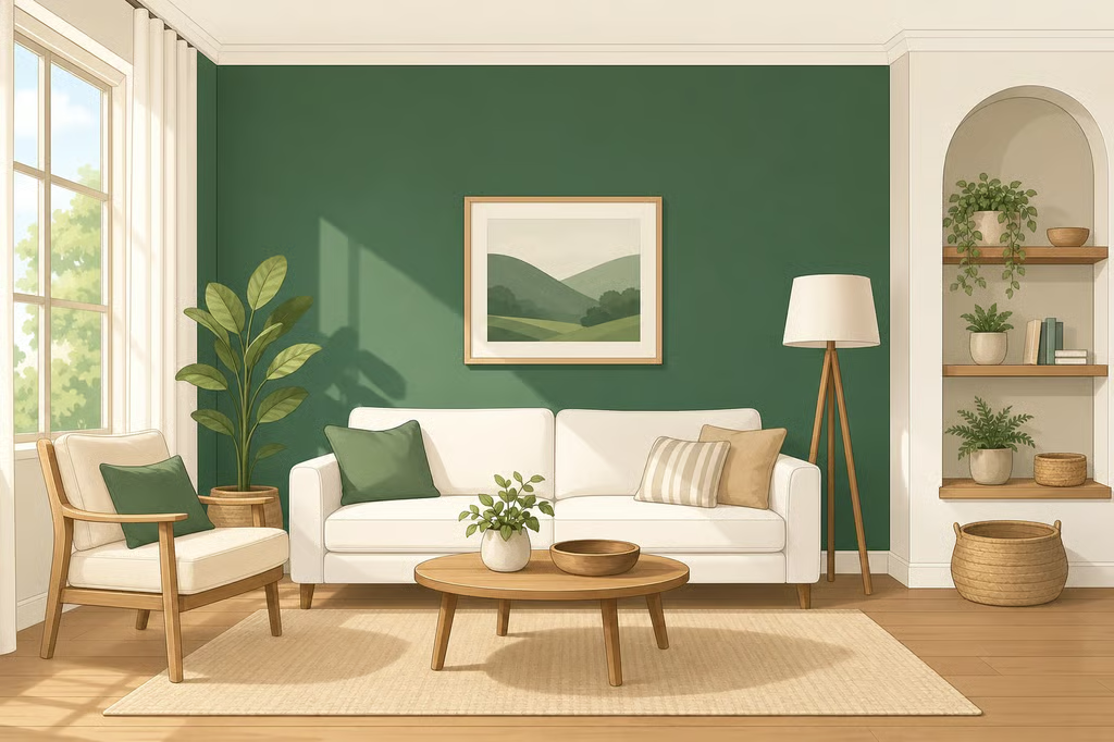
- Benjamin Moore Color of the Year 2027: Webster Green
- Benjamin Moore Color of the Year 2027: Webster Green HC-130
- Why Webster Green fits the earthy design direction
- What the reporting says about green’s appeal
- How to evaluate the Webster Green paint color at home
- What Webster Green signals for 2027 paint color trends
Benjamin Moore Color of the Year 2027: Webster Green
Benjamin Moore has named Webster Green HC-130 its Color of the Year for 2027, introducing a deeper, more strongly pigmented green in place of the softer sage shades that have shaped much of the recent conversation around green interiors. The announcement places Benjamin Moore Webster Green within the broader move toward earthy, nature-inspired color, while giving that familiar palette a more noticeable sense of depth. Ideal Home reported the announcement today.
The choice matters for anyone comparing green paint colors for a living room, bedroom, kitchen, or smaller accent area. Webster Green is not being presented as a radical departure from the nature-led palettes already popular in interiors. Its distinction is intensity. Rather than blending quietly into a room, the shade is positioned as a green with enough presence to shape the room around it.
Benjamin Moore Color of the Year 2027: Webster Green HC-130
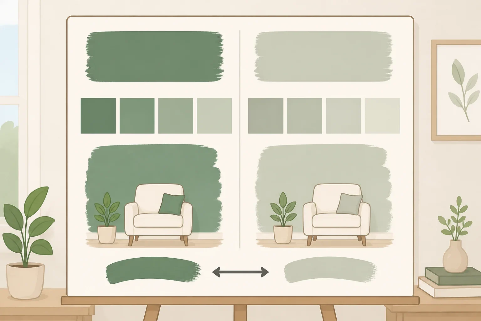
Benjamin Moore describes Webster Green HC-130 as “a quintessential green,” according to the announcement coverage. The available description focuses less on a technical breakdown of the paint and more on the feeling the brand wants the shade to convey: grounded, familiar, and energetic at the same time.
That combination is what separates the Webster Green paint color from a classic soft sage. Ideal Home describes it as more richly pigmented and notes that it has an intensity capable of bringing energy and making a statement. Those are design assessments, not a claim that the shade will look identical in every home, but they establish the central contrast for shoppers: sage tends to be the quieter reference point, while Webster Green is intended to be seen.
The distinction is useful because “green” covers a wide range of paint colors. A pale, muted green and a saturated green may belong to the same family, yet they can create very different starting points for a room. Webster Green’s announcement does not suggest that sage has disappeared. Instead, it shows how the same nature-inspired direction can move toward stronger, more confident color.
The available reporting does not establish a specific undertone, light reflectance value, finish recommendation, or universal room placement for HC-130. Those details should be confirmed through Benjamin Moore’s own product information or a retailer before buying paint for a full project. Without them, comparisons should stay focused on the shade’s reported saturation and visual weight rather than assumptions about how it will perform on a particular wall.
Why Webster Green fits the earthy design direction
The 2027 selection continues a design movement toward earthy and nature-inspired colors, as Ideal Home’s coverage notes. That context helps explain why a green was selected without making the announcement feel like a repeat of earlier muted-green trends.
Benjamin Moore’s positioning gives the color two jobs. It should feel stable enough to belong in a comfortable home, but lively enough to keep a room from becoming visually flat. Helen Shaw, Benjamin Moore’s Director of Marketing (International), describes Webster Green as pairing “reassuring stability with optimistic energy.”
That language is marketing positioning, not an independently measured psychological effect. Still, it makes the brand’s intention clear. Webster Green is meant to sit between quiet and dramatic, offering a grounded color with enough strength to become part of the room’s identity.
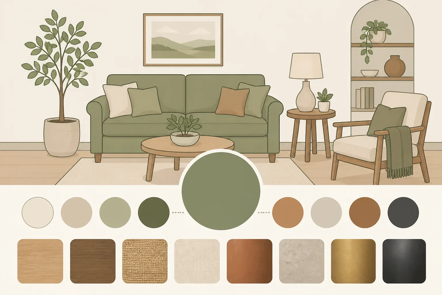
Benjamin Moore has also created a curated palette of accompanying colors intended to anchor and enhance Webster Green. The palette is described as sharing the same considered approach to grounding colors. For readers who want to use a stronger green but do not want to guess at every coordinating shade, that collection provides the brand’s own starting point for thinking about the color alongside other finishes.
It also suggests that Webster Green is not being presented only as a standalone novelty. The companion colors are part of the announcement’s larger argument: a saturated green can be used within a coordinated scheme rather than treated as a one-wall experiment disconnected from the rest of the home.
What the reporting says about green’s appeal
Ideal Home also explains green’s popularity through claims about human vision, reporting that green is often described as the easiest color for the human eye to process and that people can distinguish a broader range of green tones than any other color. The article frames those points as part of the explanation for the long-standing appeal of green.
Those claims are not independently sourced in the available coverage, so they should be treated as reported color theory rather than settled scientific evidence. They do not prove that every green will feel restful, easy to live with, or appropriate for every room. They do help explain why green can remain a familiar decorating choice even as the specific shades change.
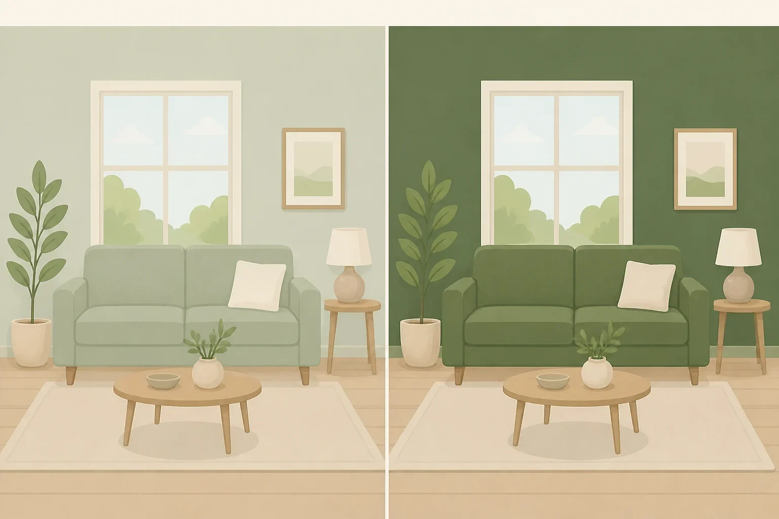
For Webster Green, the more useful point is the balance between familiarity and strength. Readers do not have to approach it as an entirely unknown color family. The shade is still recognizably green, but its greater saturation may make it more visually decisive than the pale or gray-leaning greens many homeowners have used as near-neutral backdrops.
That difference affects the commitment involved. A soft sage may be easier to fold into a room without rearranging the surrounding palette. A richer green can become a more noticeable part of the room’s overall composition. The brand’s companion palette addresses that issue by giving the shade a group of colors meant to support it, although the available reporting does not list those colors or establish how they will look in every lighting condition.
How to evaluate the Webster Green paint color at home
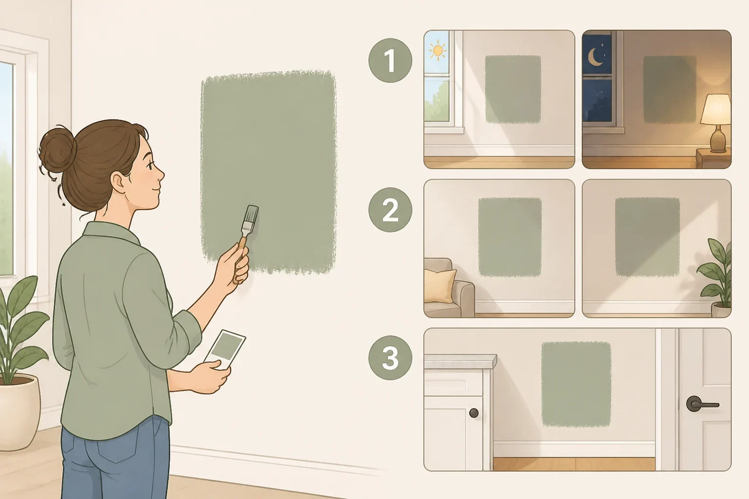
The announcement supports a clear practical conclusion: Webster Green should be judged as a stronger, more expressive green, not as a direct substitute for a pale sage. That distinction is worth keeping in mind before comparing swatches or planning a room.
A physical sample can help show whether the color fits with the room’s existing elements, including flooring, countertops, trim, upholstery, and cabinetry. That is a reader-facing precaution rather than a claim that Benjamin Moore’s materials guarantee a particular result. The available reporting does not specify the shade’s undertones or light reflectance value, so online images and broad color descriptions cannot answer every question about how HC-130 will work in a particular space.
Readers considering the color can start with three checks:
- Compare the sample with fixed finishes that will remain in the room.
- View it in the room’s daytime and evening conditions before choosing a final quantity.
- Place it beside the brand’s suggested companion colors rather than evaluating it in isolation.
Those steps do not turn a color choice into a certainty. They simply keep the decision tied to the actual room instead of the announcement image or trend language.
The room’s scale may also shape how much visual attention the color receives, but the research provided does not identify a recommended room type for Webster Green. It would be too broad to say the shade belongs only on cabinetry, an accent wall, or in a smaller room. Those are possible applications, not rules established by the announcement.
A reader who wants a quieter result may compare Webster Green with softer sage shades. Someone looking for a more prominent backdrop may respond to the intensity that Ideal Home identifies. Neither choice is automatically better. The relevant question is whether the desired room can accommodate a green that is intended to bring more energy and definition.
What Webster Green signals for 2027 paint color trends
Benjamin Moore’s selection points to a continued interest in colors that reference the natural world, but it does not simply repeat the softest version of that trend. Webster Green gives the earthy palette more weight. In the brand’s framing, stability and optimism can exist in the same shade.
That makes the color notable beyond its title. Color of the Year announcements often attract attention because they turn a broad design direction into one specific choice. Here, the choice is a green that keeps the familiar appeal of the color family while moving away from the most subdued interpretation of it.
The available reporting leaves some practical questions open. It does not provide a full technical profile, a complete list of coordinating shades, or a universal recommendation for where Webster Green should be used. Those gaps are a reason to treat the announcement as a starting point, not a promise about how the paint will look in every home.
For anyone considering Benjamin Moore Webster Green, the sensible next move is to compare a physical sample with the room’s existing finishes and watch it in changing light before committing to a full room. The shade’s defining feature is its richer intensity. That is precisely what makes it interesting, and what makes a close look at the real space worthwhile.
