
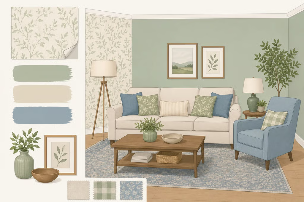
You find a wallpaper pattern you love, bring home a sample, and hold it against the wall. Suddenly, the paint looks too yellow, the sofa seems out of place, and the rug you thought would work feels too busy. Choosing wallpaper is exciting, but making it work with everything else in the room takes a little planning.
Fortunately, you don't need to replace your furniture or repaint the entire house to make a new pattern work. By paying attention to color, undertones, and pattern size, you can create a room that feels cohesive while keeping the pieces you already love.
1. Pull a color directly from the wallpaper
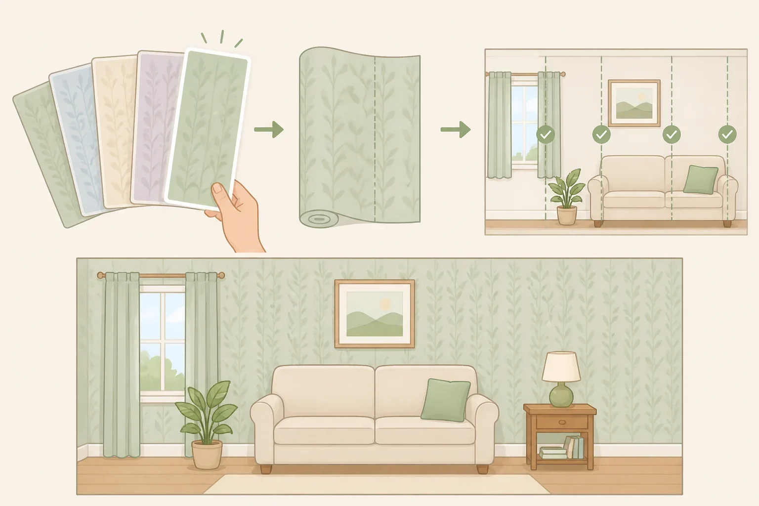
Before choosing paint, study the wallpaper's color palette. Look beyond the most noticeable shade and examine the background, smaller motifs, outlines, and subtle accents. A less obvious color may work better for the surrounding walls or trim than the boldest shade in the pattern.
Interior designer Wendi Gee, speaking to Good Housekeeping about coordinating wallpaper and decor, recommends repeating colors from the wallpaper in other parts of the room. A cushion, rug, lamp, or piece of artwork can help connect the walls with the furnishings.
You don't need to repeat every color. Choose one or two that complement the furniture you already own. For example, if your wallpaper has a cream background with terracotta flowers, cream walls and a terracotta cushion can establish a connection without making everything look overly coordinated.
Painted trim, doors, and built-in shelving offer another opportunity to pick up a wallpaper color. Interior designer Chauncey Boothby, in an Apartment Therapy guide to pairing wallpaper and paint, recommends drawing a color from the wallpaper into these architectural details, even when that shade appears only in a small part of the print.
A paint store may be able to match a specific wallpaper color or create a lighter version. However, an exact match isn't essential. A complementary shade can work just as well, particularly when the wallpaper contains several colors.
Before buying new accessories, check your existing rugs, cushions, curtains, and artwork. You may already have the colors needed to tie the room together.
2. Check undertones against paint and flooring
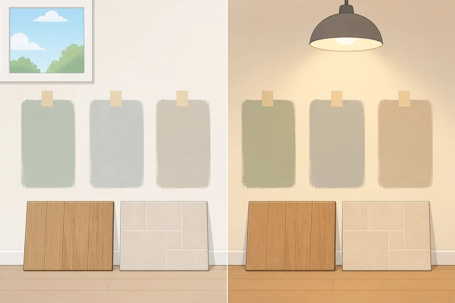
Two colors that look compatible on a screen or paint card can appear noticeably different when placed beside each other. Their undertones, or the subtle warm and cool qualities beneath the main color, often explain why.
For example, a cream paint may look too yellow beside wallpaper with a cooler white background. Similarly, a gray that appears neutral in the store might look slightly blue or green next to your flooring.
Compare the wallpaper with paint samples in the room where they'll be used. Pay attention to how the colors look in daylight and under artificial lighting. Warm wallpaper often pairs comfortably with natural wood, beige upholstery, and cream finishes, but cooler furnishings can also work when the contrast is intentional.
The room's permanent features deserve equal attention. Hold your samples beside flooring, cabinetry, tile, countertops, and existing trim. These surfaces can influence how the colors look together, especially when they occupy a large part of the room.
You don't have to match every finish. Warm wood flooring, for instance, can look attractive beside blue or green wallpaper. The important thing is to evaluate the combination together rather than choosing each color separately.
For renters, removable wallpaper offers flexibility, but it isn't automatically suitable for every painted wall. Wallpaper manufacturer Tempaper recommends smooth, properly prepared surfaces and advises against applying its peel-and-stick products over matte, flat, or other low-sheen paints. Freshly painted walls must also be allowed to cure fully according to the paint manufacturer's instructions before wallpaper is applied. Check the installation requirements for your chosen wallpaper, test an inconspicuous area when permitted, and review your lease before installation.
3. Let one element take the spotlight
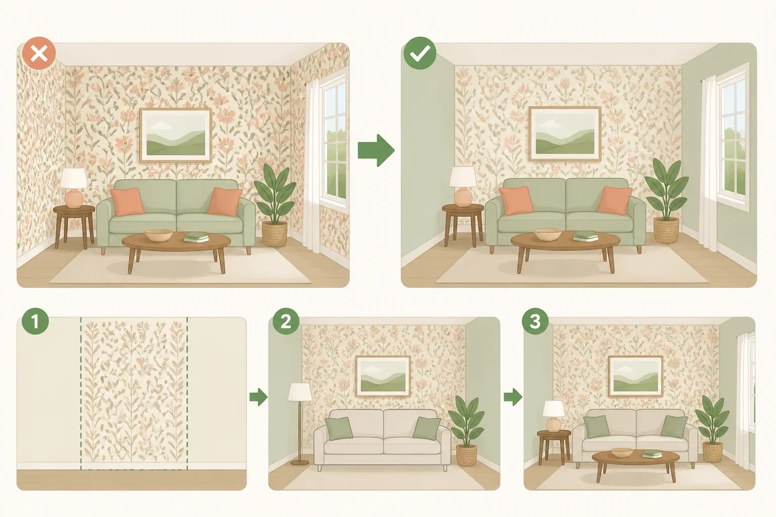
Decide whether the wallpaper or the painted walls will be the room's main feature. When both are bold, colorful furniture and accessories can make the space feel crowded.
If the wallpaper has a large floral print, striking geometric design, or several saturated colors, try pairing it with quieter paint and furnishings. Solid upholstery, natural wood, and woven textures can provide contrast without introducing another competing pattern.
That doesn't mean everything else must be neutral. A colorful chair or piece of artwork can still work, particularly when it repeats a shade from the wallpaper. The aim is to establish a focal point rather than making every element equally prominent.
For a subtler approach, use wallpaper in an alcove, behind built-in shelving, or above a chair rail while painting the surrounding walls. This allows the pattern to stand out without covering every surface.
You can also reverse the arrangement. Delicate wallpaper with a small, understated print may work beautifully alongside deeper painted walls or colorful trim.
Consider the furniture you plan to keep before making the final decision. A large patterned sofa, for example, may look better against quieter wallpaper than another equally bold design. If the furniture is mostly solid-colored, you have more freedom to introduce a striking print.
White or neutral trim is also a reasonable choice. You don't need to paint every architectural detail simply because the wallpaper contains an attractive accent color.
4. Mix patterns of different sizes
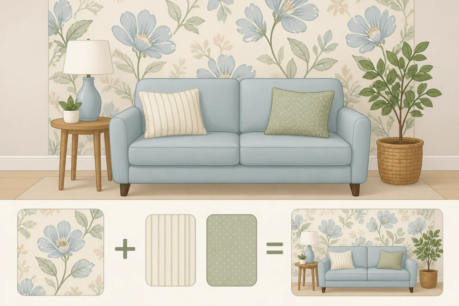
Patterned wallpaper doesn't mean your curtains, rugs, and cushions must all be plain. Mixing prints can give a room more personality, provided they don't compete for attention.
An easy starting point is to vary the size of the patterns. Pair large floral wallpaper with a narrow stripe, small check, or subtly patterned upholstery. If the wallpaper has a delicate repeating design, a larger pattern in a rug or cushion may provide an interesting contrast.
Shared colors can help different prints work together. A striped cushion might repeat a shade from the wallpaper's background, while a rug could pick up a smaller accent color.
For example, imagine a floral wallpaper with a cream background, terracotta flowers, olive leaves, and hints of muted blue. Cream walls and natural wood furniture would support the warmer tones, while a small cream-and-terracotta striped cushion could introduce a second pattern. A muted blue lamp or artwork detail would pick up another wallpaper color without overwhelming the arrangement.
Texture can add variety without another print. A woven rug, linen curtains, velvet cushion, or wooden table can bring depth to a patterned room.
Paint finish matters, too. Matte or low-sheen paint can create a soft contrast beside glossy or metallic wallpaper, but appearance shouldn't be the only consideration.
According to Benjamin Moore's guide to interior paint finishes, flat paint generally suits lower-traffic spaces, while eggshell and certain other finishes offer greater durability and easier cleaning. Some specially formulated matte paints are also washable, so check the specific product rather than relying on sheen alone.
For hallways, family rooms, and other busy spaces, choose a finish that suits both the design and the amount of wear the walls receive.
Test your wallpaper and paint together before buying
Even a carefully chosen color scheme can look different once the materials are in the room. Before ordering wallpaper rolls or gallons of paint, test the actual combination.
Start with a physical wallpaper sample and two or three shortlisted paint colors. Apply the paint to separate sample boards, then place them beside the wallpaper and the flooring, trim, and furniture that will remain.
Check the combination in morning and afternoon daylight, then again with the room's lights on. Sherwin-Williams recommends testing paint colors under different lighting conditions and suggests moving painted sample boards around a room to see how the colors change.
Look at the samples from across the room as well as up close. A pairing that appears subtle from a few inches away may look much stronger across an entire wall.
If something feels off, change one element at a time. Try a warmer or cooler paint color, a softer shade, or a different pattern scale. Small adjustments are easier to evaluate when the rest of the combination stays the same.
Before placing a full wallpaper order, check the manufacturer's measurements, pattern repeat, and return policy. Matching a design across adjoining strips may require additional material, so calculate how much wallpaper you'll need rather than relying on wall area alone.
The best combination isn't necessarily the one where every color matches perfectly. It's the one that looks right alongside your furniture, flooring, and favorite pieces. With a little testing and a few carefully chosen connections, new wallpaper can make the whole room feel refreshed without starting from scratch.
